My Showit Design Contest Story
Little story time: earlier this year, I entered a Showit website design contest with Tonic Site Shop — and spoiler alert, I won.
I was honestly so happy about it. The designs were voted on by the public, so I shared the contest on my social media, but what surprised me most was seeing people I didn’t even know voting for my design. That felt really special, and I’m incredibly grateful to everyone who supported me.
But the contest also reminded me of something I think about constantly when I design brands and websites: the details matter.
Before I became a Showit website designer, I worked in fashion, so textiles, color, texture and styling have always been a huge part of how I see the world. When I started creating my contest design, I knew I didn’t want to rely on another predictable color palette or make something that simply looked “pretty.”
I wanted it to have a point of view.
And that’s exactly what I want to talk about today: how you can use texture, color and visual contrast to make your own website feel more distinctive.
01 — Start With Texture, Not Just a Pretty Image– Showit it Design Hacks that makes a difference
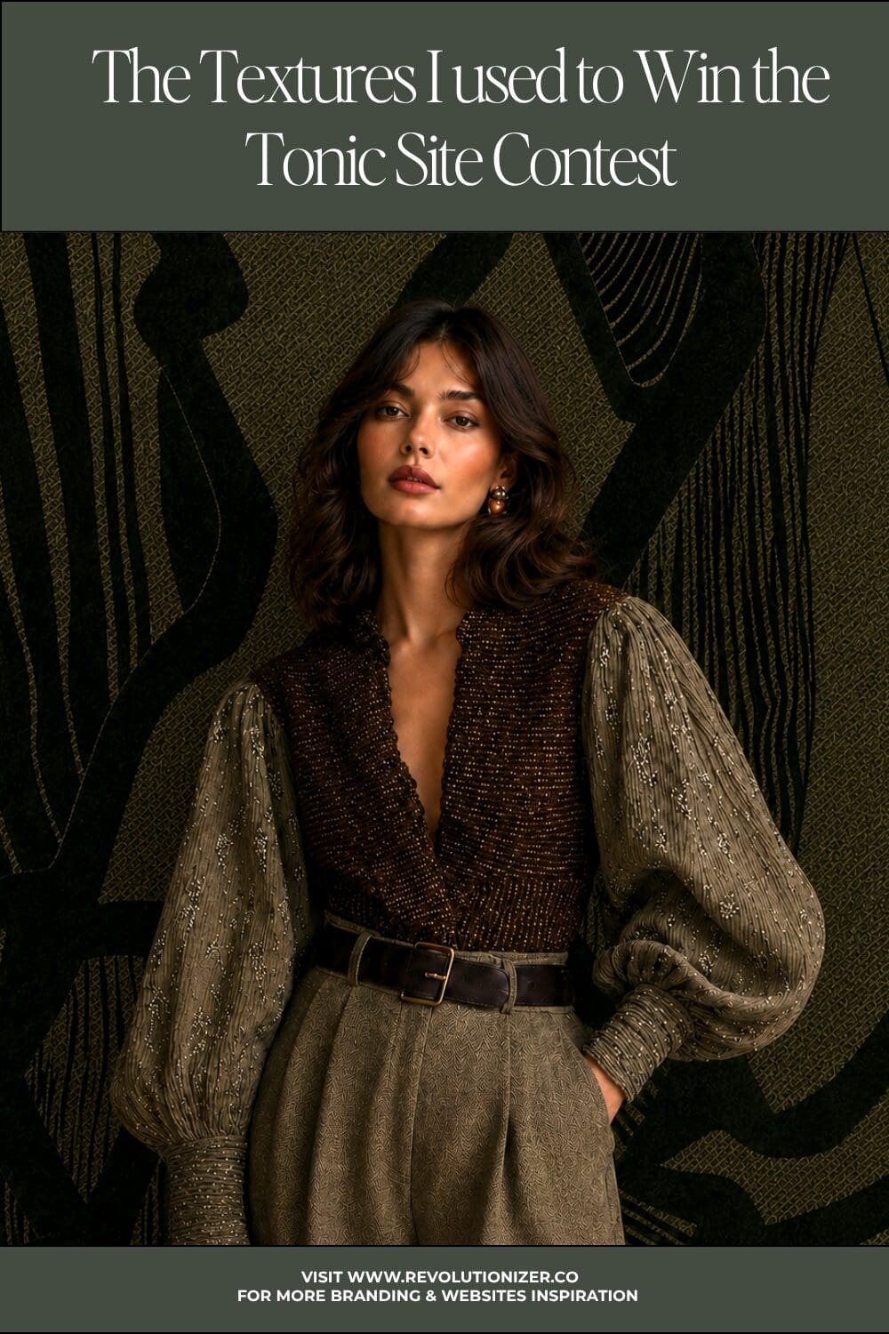
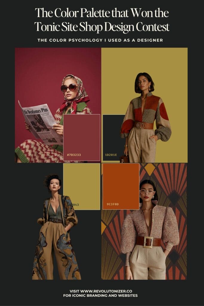
For this design, I used textiles as part of the visual language and brought them into the background.
This is one of those small Showit website design details that can make a surprisingly big difference. Instead of treating every section of a website as a flat block of color, you can introduce a subtle textile, paper, fabric or material texture to give the page more depth.
You could use a textile as a full-width background, crop a close-up section of it or layer it behind typography and imagery. You could even photograph something from your own creative process and turn that into a background texture.
The key is contrast. If everything is textured, nothing feels special. But when a tactile, imperfect texture sits next to a clean section of typography or photography, your eye notices the difference.
This is one of the reasons I love working with Showit — you have so much freedom to experiment with layering, positioning and composition instead of having every element locked into a predictable layout.
If you want to see how I use this kind of thinking in actual projects, you can explore my portfolio. It’s always interesting to look at a finished website and then notice all the small decisions that helped create the overall feeling.
02 — Your Color Palette Doesn’t Have to Look Like Everyone Else’s– This can make your Showit Website Design to Stand Out
This was probably one of the most important decisions in my contest design.
I chose a palette built around deep burgundy, almost-black green, smoky blue, burnt orange, golden yellow and a soft dusty beige. It feels warm, editorial, slightly unexpected and very connected to fashion.
And that’s exactly why I loved it.
There are so many industries where we unconsciously choose the same colors over and over again. A jewelry brand becomes black and gold. A wellness brand becomes beige and sage. A feminine business becomes pale pink.
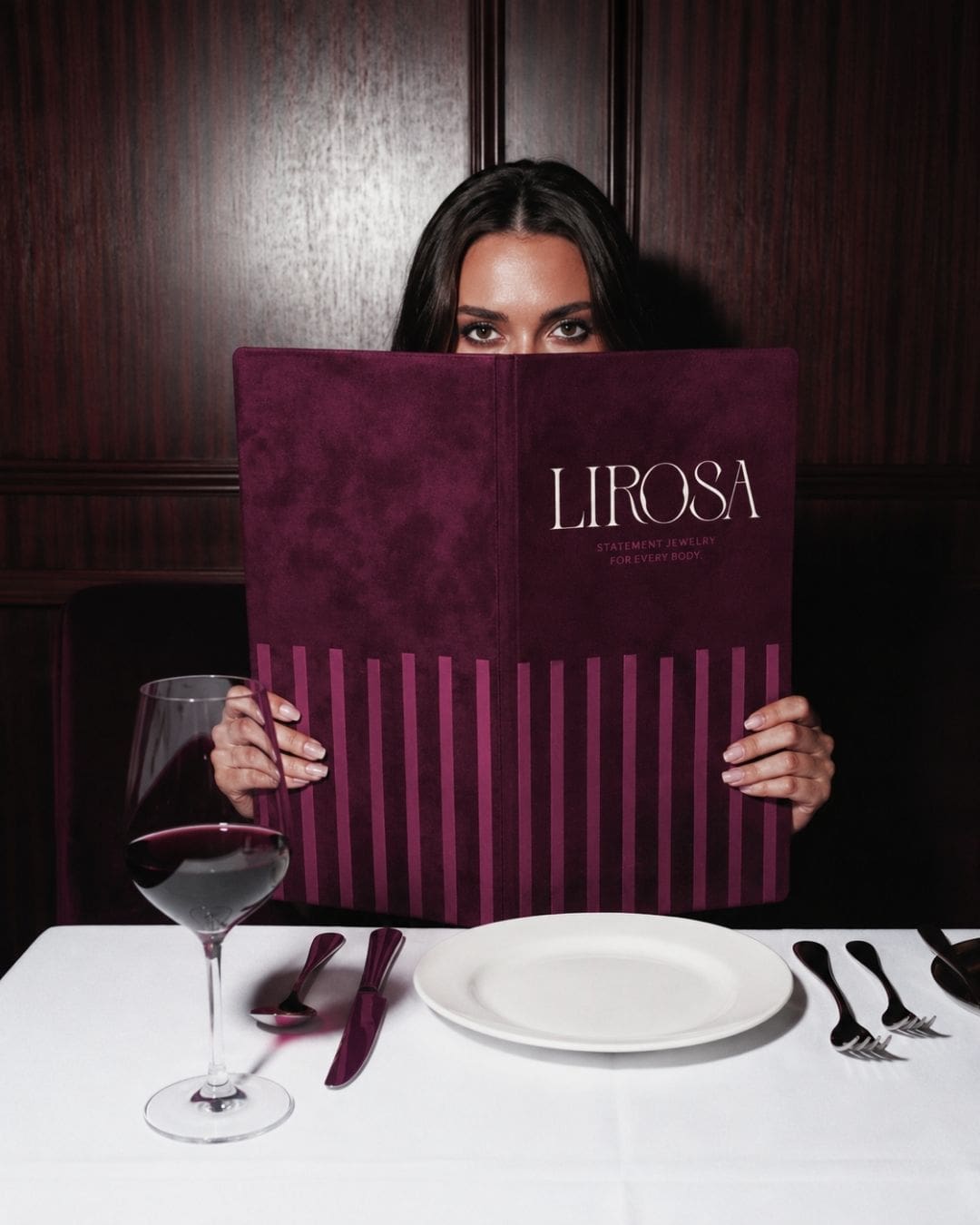
There is nothing wrong with those colors. But your brand doesn’t have to look like the category you’re in. For example the following picture is the color palette for this amazing jewelry designer I’m working with now.
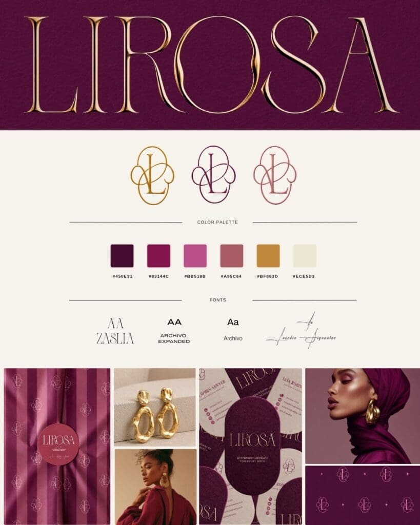
Fuck yeah right? When you’re creating your own brand, I recommend looking beyond other websites. Look at fashion editorials, interiors, paintings, old magazines, packaging, architecture and even fabrics. Pinterest can be a great place to collect these references and start noticing the colors and visual combinations you’re naturally drawn to. I also share a lots of useful design ideas on Pinterest maybe that can be helpful as well.
Don’t just ask, “Is this pretty?”
Ask, “Does this feel like me?”
That question will usually take you somewhere much more interesting.
03 — The Psychology Behind My Color Palette
This is where the palette becomes even more interesting.
I didn’t choose these colors randomly. I wanted the combination to create a feeling of confidence, warmth, depth and individuality without becoming overly feminine or predictable.
The deep burgundy brings a sense of richness and confidence. It feels expressive and a little sensual without being bright or obvious.
The almost-black green gives the palette grounding. It adds something earthy and sophisticated, while also creating a strong contrast against the warmer tones.
Then there is the burnt orange. This is where things become more playful. Orange can feel energetic, creative and optimistic, and the darker, more muted version keeps it feeling sophisticated rather than loud.
The golden yellow adds warmth and a little unexpectedness. It catches the eye without needing to scream for attention.
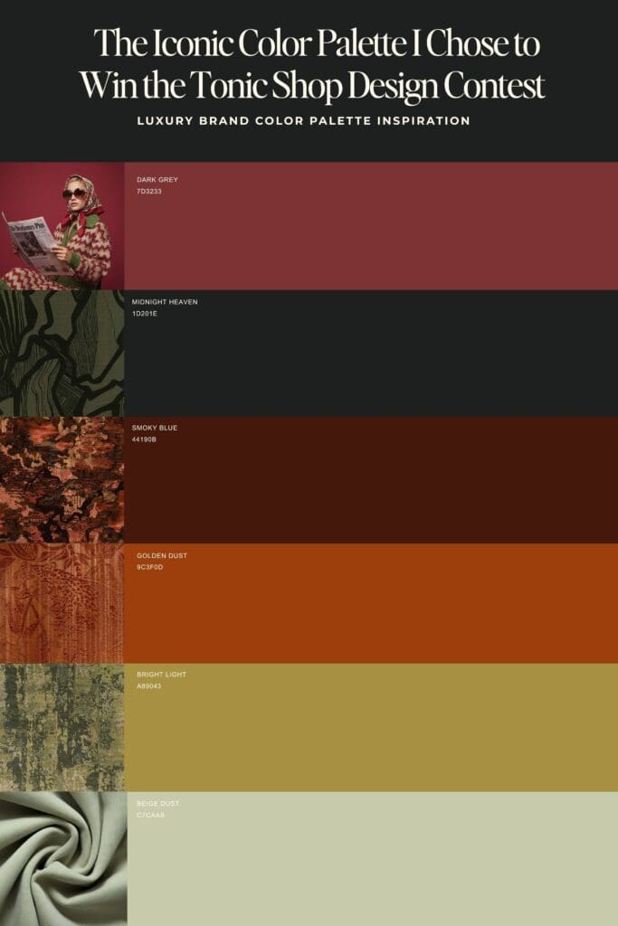
And finally, the dusty beige softens everything. It gives the palette somewhere to breathe and prevents all those deeper colors from becoming visually heavy.
The magic isn’t really in one color. It’s in the relationship between them.
That’s something I think is important for any brand identity. Color psychology isn’t about choosing “blue because it means trust” and calling it a day. It’s about how colors interact, what you pair them with and the emotional world they create together.
A color can feel completely different depending on the typography, photography, texture and surrounding colors.
That’s why I always look at the whole picture when developing a visual identity — not just individual elements.
04 — Don’t Forget That Your Website Still Has a Job to Do
I love experimenting with visual design, but there is one thing I never want to lose: the website still needs to work.
You can have the most beautiful color palette in the world, but if your visitor doesn’t understand what you do, can’t find your services or doesn’t know what to click next, the design isn’t doing its job.
For me, good Showit website design sits somewhere between creativity and strategy.
I want the website to feel like you, but I also want it to guide someone through your business naturally. Where should they go first? What should they understand? When should they see your work? Where does the call to action appear? What makes them curious enough to keep exploring?
Those decisions are just as important as the colors.
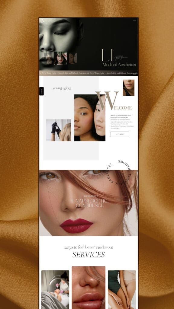
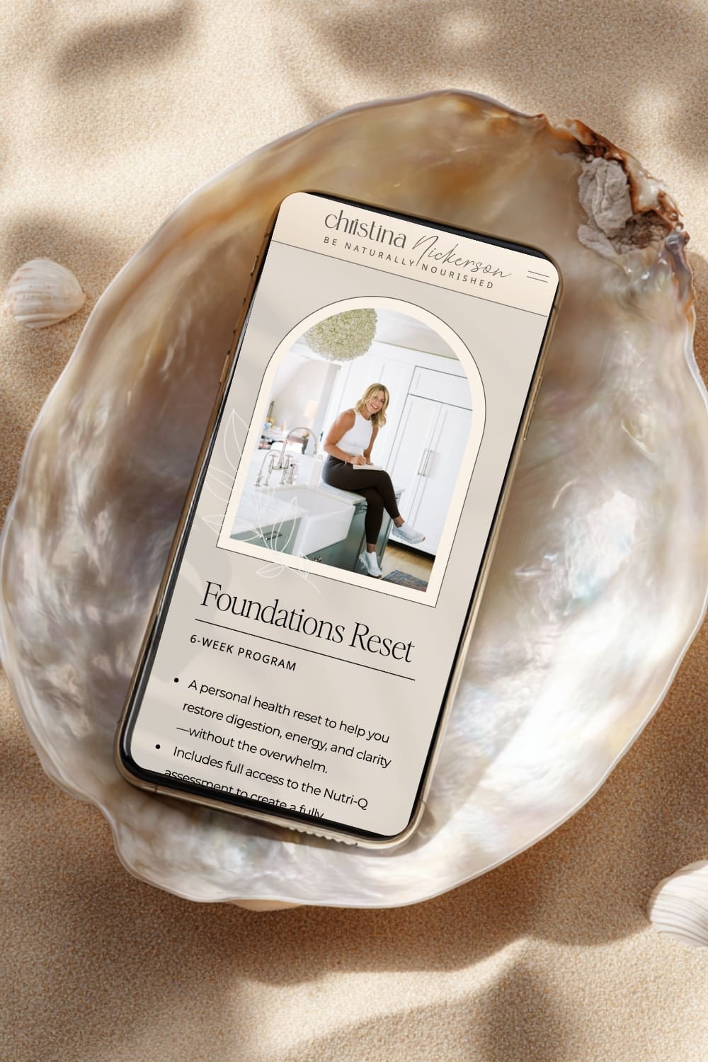
If you’re thinking about your own website and realizing there are quite a few things you’d like to rethink, you can explore my branding and web design services. This is exactly where I love getting involved — looking at the bigger picture and turning all those individual ideas into something cohesive.
And if you’re not ready for a completely custom project, you can also browse my Showit website templates for a more flexible way to create a beautiful, intentional online presence.
A Little More Personality Goes a Long Way
Winning the Tonic Site Shop contest was such a fun experience, but I think what I loved most was being reminded that good design doesn’t always come from following the “right” formula.
Sometimes it comes from your past experiences. Your references. The things you’re obsessed with. The colors you keep saving. The materials you can’t stop photographing.
For me, that was fashion and textiles.
For you, it might be something completely different.
And that’s the part I want to bring into every Showit website design I create: finding those little pieces of your personality and perspective, then turning them into a website that feels unmistakably yours.
If you’re curious about what that could look like for your own business, you can book a call with me here. I’d love to hear what you’re building.
Love,
Blanka