Website design mistakes that make your business look less premium
Before I got into branding and web design, I worked in fashion. I’ve always believed that design has the power to change how we see something, and even how we see ourselves. And after working in branding and website design, I’ve noticed that some of the biggest problems aren’t necessarily obvious. Your website can look beautiful and still have small website design mistakes that make it harder for the right clients to connect with your business.
I’ve always been fascinated by why certain things feel right. Why putting on the right outfit can completely change the way you carry yourself. Why some images stay in your head long after you’ve seen them. Why certain brands instantly make you want to know more about them.
And when you’re trying to attract premium clients, those tiny details matter a lot.
Because people aren’t only deciding whether they like your service. They’re deciding whether you feel like the person they want to invest in.
So if you’ve been wondering whether your website is actually helping your business grow, here are four website design mistakes I’d look at first.
01. Your Website Is Trying to Look “Professional” Instead of Looking Like You.
This is something I see a lot.
Especially with women who have been in business for a few years. At some point, you were told that a “professional” website should look a certain way.
Clean. Minimal. Neutral. Serif font. Lots of white space. Maybe a little beige for good measure.
And suddenly everyone is using the same visual language. The problem isn’t minimalism. I love beautiful minimal websites.
The problem is when your design decisions are based on what you think a successful business is supposed to look like instead of what actually feels like you.
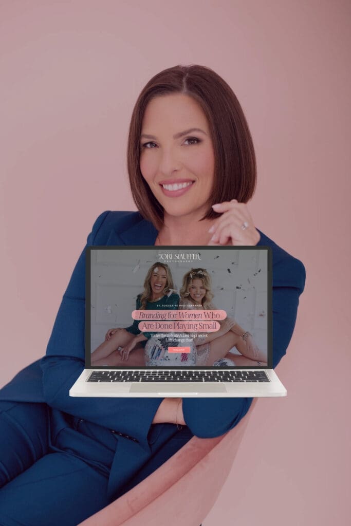
I’ve worked with brands where the most interesting part wasn’t their colour palette or their logo.
It was their personality. Their references. Their weird little ideas. Their taste. The way they talk. The things they notice.
Those are the details I want to bring into the design. Because if your website looks “correct” but completely forgettable, it isn’t doing enough.
A premium brand doesn’t have to look “perfect”. It has to look intentional. Your personal energy will make it exceptional and unforgettable.
And sometimes being intentional means choosing the unexpected option. The color you were told was “too much.” A photograph that feels slightly imperfect. A typography combination that doesn’t look like every other coach’s website.
A tiny detail that someone only notices after scrolling for a while. Those things can make a brand memorable. And I’d take memorable designs over “perfect-looking” any day.
02. Your Website Has No Visual Hierarchy
This one sounds very design-y and technical but it makes a huge difference.
This is one of those website design mistakes that’s easy to overlook because nothing is technically “wrong.” You can have great branding, beautiful photography and really good copy… And still have a website that feels confusing.
Why?
Because everything has the same importance. Your headline is competing with your image. Your image is competing with your button. Your button is competing with your next section.
Your testimonial is screaming just as loudly as your main offer. And suddenly I don’t know where I’m supposed to look.
Think about a really well-styled outfit. You might have an incredible jacket, beautiful shoes, jewellery, a bag and a great pair of trousers.
But if everything is the statement piece, nothing is.

Web design works exactly the same way. Your homepage needs a visual hierarchy. I should know what you want me to see first. Then second. Then third.
Your CTA should be obvious without screaming. Your supporting information should support rather than compete. And this is something I pay a lot of attention to when creating a Showit website design.
Because the goal isn’t just to make each section look beautiful individually. It’s to make the entire page move.
There should be moments where my eye stops. Moments where I’m curious. Moments where I understand something. Moments where I’m encouraged to take the next step.
That’s what makes a website feel considered. Better direction.
03. You’re Designing for Everyone, So Your Website Doesn’t Really Attract Anyone
This one is uncomfortable.
But I think it’s important. A lot of business owners want their website to appeal to as many people as possible. So they make everything safe. The copy becomes more generic. The colours become more neutral. The personality gets toned down.
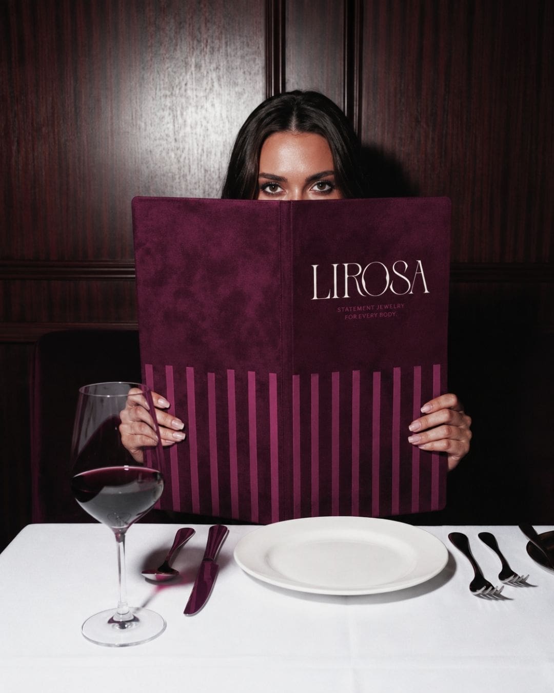
The message becomes: I create beautiful, high-quality jewellery for women who want to feel confident, unique and empowered.”
Okay. But who are you? And more importantly…
Does your website make the right client think, “This is exactly what I’ve been looking for”?
Premium positioning isn’t about making your business inaccessible. It’s about becoming specific enough that the right person recognises themselves in it.
Your website should make some people think: “Not for me.”
And the right people think: “Oh. Finally, this is exactly what I’ve been looking for.”
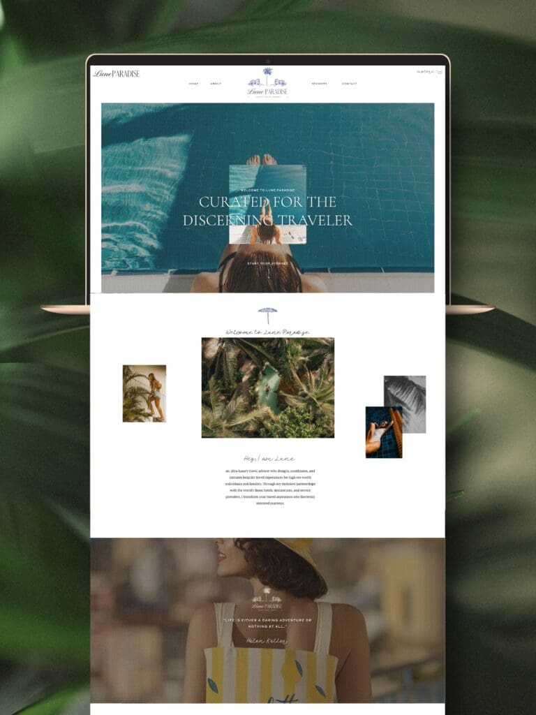
That’s a much stronger position.
If you’re a photographer who only wants to work with fashion brands, don’t make your website sound like you photograph everything from newborns to corporate headshots.
If you’re a coach working with established female founders, your messaging shouldn’t sound like you’re speaking to someone who has just opened their first business.
If you’re a designer creating elevated brands for creative entrepreneurs, let your taste actually show.
You don’t need to appeal to everyone. You need to be recognizable to your people.
And that’s where your branding, positioning, copy and website design need to work together.
04. You’re Treating Your Website Like a Brochure Instead of an Experience
This is probably my favourite one. Because I think a really good website should feel a little bit like walking into someone’s world.
Not just: Here is my About page. Here are my services. Here is my portfolio. Here is my contact form. Bye.
Your website is often the first experience someone has with your business.
So why not make that experience interesting? Maybe there is a little unexpected animation. Maybe your navigation behaves differently than someone expects.Maybe there’s a detail hidden in the page.
Maybe your photography changes the mood as you scroll.
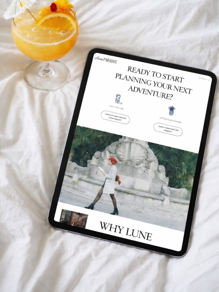
Maybe your copy tells a story instead of simply explaining information.
Maybe your Showit web design has small interactive details that make someone stop and think, “Oh, that’s cool.” Those details don’t need to be complicated.
They just need to have a purpose.
This is actually one of the reasons I love Showit so much for creative businesses. It gives you much more freedom to create a website that feels like a brand experience, rather than something that looks like it came straight from a template.
And no, I don’t mean adding animations everywhere. I’m talking about creating moments.
The little things someone remembers after they’ve left your website. Because that’s what branding is really about. Creating a feeling that stays with someone.
Your Website Doesn’t Have to Tell Your Whole Story
I think this is something a lot of business owners forget when they redesign their website.
You don’t have to put everything on it. Every detail about your process. Every reason someone should work with you.
“Your website isn’t your entire business. It’s the doorway into it.“
Its job isn’t to give someone every possible piece of information before they contact you. Its job is to make the right person curious enough to keep exploring, trust you enough to consider working with you, and excited enough to take that next step.
And I think there’s something quite powerful about leaving a little room for curiosity.
Sometimes, less information creates more desire. The good news is that most of these website design mistakes are fixable.
Think about your favourite brands. They probably don’t tell you absolutely everything the second you discover them. They give you just enough to make you want to look closer.
That’s the feeling I want a website to create. Not pressure. Just that quiet feeling of:
“I like this. I want to know more.”
And from there, your website can do what it’s actually supposed to do: guide someone towards the next step.
That’s something I think about a lot when I’m designing a custom Showit website or building a brand experience for a client. I’m not just thinking about how a page looks when it’s finished. I’m thinking about what I want someone to feel at each stage of moving through it.
I think this is one of the reasons I love what I do so much. I get to take everything that makes a business that business and translate it into something visual, something you can actually feel when you land on the website.
And if you’ve been feeling that little disconnect between the business you’ve built and the website you’re currently showing the world, I’d love to help you explore what it could become.
Come have a look around Revolutionizer Studio, explore my work and services, and if it feels like we’re a good fit, I’d love to hear about your business.
And if you’re not ready for a fully custom website yet, my Showit templates are there for you too.
Your website should feel like a place your business has finally arrived.
With love,
Blanka